This is part one of what will be a multipart blog series: how tremendously exciting, eh?! In all seriousness, with GNOME 3 imminent, I thought rather than do a review of the desktop it would be much more interesting to talk about it from the perspective of a relatively hardened Linux enthusiast actually using it within a business environment.
First up, disclosures: I’m an extremely happy GNOME 2 user. I have a copy of Fedora 12 on my Eeepc 901 netbook, with what is now a relatively ancient version of gnome-shell on it, but to be honest the shell is little more than an interface for launching Firefox on that machine. Other than that, I’ve not really used GNOME 3 / gnome-shell in more than passing. I called this post “Drag me to shell” quite deliberately: honestly, I’m happy with GNOME 2. But, I’m somewhat forcibly trying to move myself to GNOME 3 full time. (Yes, I have seen these various KDEs and Unitys an other desktops. No, I’m not interested, and this isn’t meant to be taken as some kind of comparative to other systems. Also, I’m running this on what is to become Fedora 15, which has changed like wind blowing sand recently, so there’s stuff in here that may well change before the final GNOME 3).
When you log into a desktop for the first time, when it’s freshly installed, it kind of has this blank newness look to it. It’s a lot like new car smell, and it doesn’t tend to last very long as you install stuff, reconfigure the theme, stick files on the desktop and all that – very soon, it’s looking a bit worse for wear and you have to start tidying up things again. Now, initially, getting into GNOME 3 felt quite restrictive: there’s a few things which aren’t there, there are limited controls on how the desktop feels. But, a few days in, I’m already beginning to appreciate this – like a self-cleaning oven, that new car smell hasn’t yet gone away. It will be interesting to see if it does.
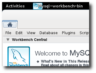
Of course, I have already installed a lot of my business apps. I need Firefox, Evolution and LibreOffice like most knowledge workers, and to be honest things really aren’t much different here. Firefox 4 is an awesome upgrade to 3, and although there isn’t much in the way of genuine GNOME integration, this is all meat and potatoes stuff. However, I also do a lot of development – both web development and “real” software – and it’s relatively crucial to me that these other things work well. I’m a keen user of MySQL Workbench for administration and schema design, and I tend to edit my code in either Geany or vim depending on the project.
Thankfully, the workflow with these apps hasn’t really changed much. Like many “enterprise” apps, Workbench presents a tabbed MDI interface with only a single window: it doesn’t really take advantage of any of the new stuff in the shell, but it doesn’t come a cropper much either. The only slight oddity is that the interface now sprouts entirely out of a “Home” tab in the most peculiar fashion:
I don’t think this is a GNOME 3 thing, it seems to be something that Workbench as acquired all on its own. Very odd, but hardly a huge issue in practice – I just end up with an awful lot of grey space on the toolbar.
So that’s normal apps which tend to run as single windows. However, for apps that have multiple windows, I think things have improved tremendously in GNOME 3. I’ll walk through one example – using the GIMP for graphical editing – the terminal/command line being an obvious one.
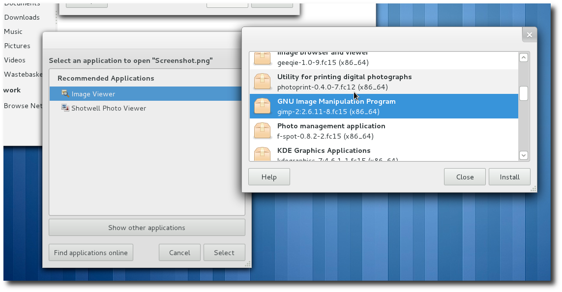
Now, right off the bat, there are some nice touches in GNOME 3 that either weren’t in earlier versions or I just didn’t notice them. One thing I really appreciated was the hook up between the local MIME database and the remote list of applications available. I’d logged into my fresh install, but hadn’t yet put the GIMP on – so when I asked it to open a picture, it didn’t have that in the options though. But look what I could do from there:
The window on the left is what I got – the “which application should I open?” – but then, at the bottom, as well as showing me other apps I have available on my system, there’s also the “Find applications online” button. Click on that, and I get this new list on the right. Granted, it’s not amazingly pretty, but it basically just gave me a list of applications which fiddle with images, and right in the middle there was GIMP. Click, click, done. Excellent: I didn’t have to go all the way into add/remove applications and do a search there and come back, the workflow was really smooth.
And once you get into the GIMP things have improved again. GIMP is an MDI application as well, but gives you multiple windows, not tabs. You have a toolbar window, another window for layers, and then a window each for every image you have open. With other window managers, I have to say sometimes it was a bit of a pain to navigate around these windows using either the mouse or the keyboard.
So here’s where it starts getting good. Whether by chance or design, the toolbar opens up stuck to the top-left corner, and the layers window stuck top-right. The picture opens up in the middle. This is a really great, sensible default. But then, as you open up further windows (copying image parts between different buffers is a really common workflow for me), the new Alt-Tab switcher really starts to come into its own.
Sadly, I can’t seem to screenshot this (having to hold down Alt interferes I suppose), but as well as the application icon coming up in the switcher, the two windows appear beneath. I can click on them with the mouse if I want, or – even better – I can use the brand new (to me?) Alt-` combo (the key above tab) to cycle through the application windows. Note, it doesn’t cycle to toolbar or layers – just the actual windows I’m operating in, the images. I cannot sufficiently describe how cool Alt-` is and how it’s already becoming part of my muscle memory.
I have a feeling the window management stuff is going to be a little bit make-or-break for some people. I use workspaces a lot, and it’s crucial to me that they work well. Because of this, having to Alt-Up or Alt-Down to switch feels somewhat unnatural – I don’t know why, but the landscape of left-to-right just makes more sense. Now, I don’t yet have a dual monitor setup, and I have to say that as a power user I would imagine it would make more sense to spin workspaces up and down like a slot machine if I had screens side-by-side. But, right now, this does jar a bit.
Next post, I’m going to go into file management. Right now, I have a lot of problems in this area: as an obvious example I used the “Desktop” folder as a project space. I have scripts which would move files on and off the desktop while I was working on them. Now, Desktop as a folder still exists – but, it just doesn’t mean anything any more, and Nautilus basically prefers to be in the home directory. Accessing files through the GUI is now much more of a pain. However, I’m going to work on this and see how I feel after a week – maybe there are things I’m missing, maybe there will be new ways of doing things, maybe right now it just is that bad. Tune in for part 2 if you care.
